


Have you heard the buzz about Android’s latest redesign? It’s creating quite the stir in 2025, and for good reason! Google’s new Material 3 Expressive design is right around the corner, and while many are excited about the fresh look, there’s one feature that’s causing some mixed feelings: the ubiquitous background blur. Let’s dive into the details and see what this means for you!
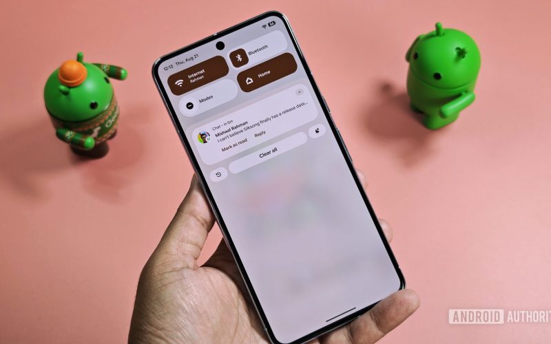
So, what’s the deal with all this background blur? It pops up everywhere in the new design—from the Quick Settings panel to the notification shade, and even on the lock screen and in the app drawer. For some users, this can be a bit distracting, especially if you’re someone who values clarity and readability in your interface. Thankfully, Google has heard the concerns and is stepping in to help.
In a recent interview, Mindy Brooks, Google’s VP of Product Management and User Experiences on the Android Platform, shared some exciting news. She revealed that soon, users will have the option to disable background blur. This is a game-changer for those who find the blur a bit overbearing. If you’re worried about how this might affect your experience, you’re definitely not alone!
Now, you might be wondering why Google chose to implement this blur effect in the first place. According to Brooks, the idea behind it is pretty clever: by minimizing distractions through blur, your attention is directed toward the key elements of the user interface. Imagine this as a way to focus on what really matters without being sidetracked by the visuals lurking in the background. Sounds good, right?
But here’s where it gets tricky: finding the perfect balance. If the blur is too subtle, the underlying visuals can still grab your attention. On the flip side, if it’s too strong, it could completely overshadow the aesthetic appeal of the design. Brooks believes that Google has struck a decent balance, but it’s clear that not everyone will agree. Thankfully, the upcoming customization option will allow users to tailor their experience to their liking.
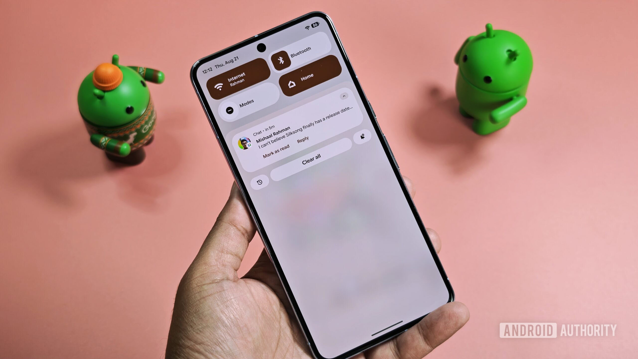
While Google hasn’t announced a specific release date for this feature, Brooks indicated that it’s on the way. Many are hoping to see it included in the second quarterly release of Android 16, but as of now, it’s not in the latest Android 16 QPR2 Beta 1 release. So, we’ll just have to stay tuned!
“Implementing this option shouldn’t be too difficult for Google, especially since a system-wide toggle to disable background blur already exists in Android’s Developer Options,” said Brooks.
It’s worth noting that while turning off background blur may enhance readability, it could also lead to slight improvements in battery life. The blur effect requires GPU processing, which can drain battery resources, albeit minimally. In fact, Android’s own battery saver mode disables this effect to help conserve power. So, if you’re looking to save a bit of battery during those long days, this new option could be a double win.
For those of you eager to learn more about Material 3 Expressive, there’s plenty to explore. You can check out our deep dive into the new design language or catch the full interview with Mindy Brooks, where she discusses the journey behind this redesign. My cohost Ron Richards and I had the pleasure of diving into how Google approached making this design appealing to a diverse audience, all while considering accessibility.
As we wrap up, it’s clear that Android’s new look is stirring up excitement and conversation in the tech community. Whether you love the new blur effect or prefer to have the option to turn it off, one thing is for sure: Google is listening to its users and responding to their needs. So, keep your eyes peeled for this upcoming feature, and get ready to customize your Android experience like never before!
Thank you for being a part of our community! We value your insights and encourage you to share your thoughts. Don’t forget to read our Comment Policy before posting your feedback!